The Pricing Power Illusion and Why this ETF Got it Wrong
An attempt to quantify pricing power raises big questions—here’s what really matters for investors.

I am not a big fan of academic papers on investing. There are far too many of them, and only a tiny fraction have any relevance to real world investment. I am, however, a bigger fan of quantitative practitioners’ analytical reports as they often question received wisdom. As these are data-backed, they are more likely to be relevant and the data can be interrogated.
I only recently learned that Bloomberg employed data scientists or quants whose research is powering certain ETFs – nothing like going into competition with your customers. I view pricing as a central component of quality and was intrigued to learn more about the science behind the Invesco Bloomberg Pricing Power ETF selection process.
I am slow on the uptake as the ETF has been around since the end of 2006. Its performance since 2009 has badly lagged the S&P500, but then, what hasn’t?
POWA Relative to S&P500

Source: Behind the Balance Sheet from Yahoo Finance Data
Perhaps the reason I hadn’t spotted it previously was that its name only changed in August, 2023. Previously the Invesco Defensive Equity ETF (DEF), now the Invesco Bloomberg Pricing Power ETF (POWA). The issuer was Invesco Indexing LLC and is now Bloomberg Finance, L.P and the management fee was reduced from 0.5% to 0.4%, still high for an ETF.
The blurb explains that the fund
“is based on the Bloomberg Pricing Power Index (Index). The Fund will invest at least 80% of its total assets in securities that comprise the Index. The Index is composed of U.S. large- and mid-capitalization companies that the Index Provider believes are well-positioned to maintain stable profit margins in all market conditions while focusing on companies that have the smallest deviations among their annual gross profit margins over the last five years. The Fund and the Index are rebalanced quarterly.”
To translate, they believe that pricing power can be selected quantitatively by taking the companies with the lowest standard deviation of gross margins in the prior 5 years. The logic behind this, I believe is two-fold:
Companies with pricing power often raise prices and attract competition.
A more durable version of pricing power is to maintain stable prices and margins and use that pricing power to widen the moat, the strategy Warren Buffett prefers.
Hence stable gross margins may indicate a more durable competitive advantage. The fund has 50 stocks and the sector exposures are shown in the table:
POWA Sector Exposures

Source: Behind the Balance Sheet from Yahoo Finance Data
It’s quite an unusual mix. I wouldn’t generally consider financials to have pricing power, but MSCI clearly does when it comes to its index business, some of its sellside research less so. But I shall cover selection criteria in a moment.
Similarly materials, where Du Pont makes an unexpected appearance – I had assumed this must be an aggregates business. Real estate includes data centre operator Equinix and document storage specialist Iron Mountain.
The constituents below could be a useful first screen for potential quality stocks.
POWA Constituents
Source: Behind the Balance Sheet from Yahoo Finance data
The Related White Paper
The white paper published by Bloomberg includes the following table of the top 20 companies that are most frequently featured in the regional pricing power indices in the period 2013-2023. This included some surprising names. Again, this could be a useful list of potential quality stocks. I have extracted the US and European entries in the table:
Stocks with Consistent Pricing Power
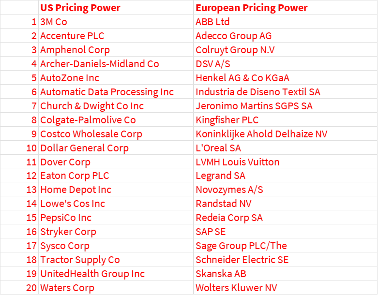
Source: Bloomberg Inidces Prising Power Everywhere
It’s no surprise to see Pepsi, Stryker, Waters Corp, L’Oreal, LVMH, Henkel and similar businesses here. But I was surprised by the inclusion of the DIY companies, less so Home Depot and Lowe’s in the US, but Kingfisher? Here is the chart of their gross margin trends:
DIY Players Gross Margins

Source: Behind the Balance Sheet from AlphaSense data
I was mildly surprised that Kingfisher’s gross margins were so stable and higher than its US counterparts. I perceived Home Depot as a well-managed business, and Lowe’s as a strong number 2. Recent gross margin trends have been similar, albeit with Lowe’s having a more volatile history.
But pricing power leading to stable gross margins is only one part of the story. Kingfisher has hardly grown revenues over the last 10 years while the US players exhibited strong growth, although that has slipped back for Lowe’s in particular last year, as consumers spent less on big ticket DIY.
DIY Revenue Trends

Source: Behind the Balance Sheet from AlphaSense data
Sidenote: I keep asking people I meet how they are using AI. I just asked Alphasense “Why did Lowe’s revenue fall last year?” –this is what the system returned:
AlphaSense Response to Inquiry

Source: Alphasense
Margins have moved up for the number 2 player, in quite a significant way. This is a really interesting phenomenon, and it’s one of my key issues when I analyse a sector. Many quality oriented investors argue that you should always buy the #1 player in an industry. I have a whole section in my Analyst Academy course on why it’s often a much better strategy to buy the number 2 player - usually the number 1 has the best margins and the highest valuation. Sometimes, you can make more money buying the lower rated #2 and enjoy a stronger performance as the margin gap and the valuation gap are narrowed. This is a good example. I should do a Substack on buying the number 1 vs number 2 player.
DIY Margin Trends

Source: Behind the Balance Sheet from AlphaSense data
And the share price comparison doesn’t quite show the more recent relative performance of Lowe’s vs Home Depot but it clearly illustrates that they have done really well, while Kingfisher has been a dog.
DIY Share Prices

Source: Behind the Balance Sheet from AlphaSense data
This is pretty conclusive evidence that gross margin variability is only one part of the story, and that you need to understand pricing power in a qualitative fashion, as well as in a quantitative framework. The same is true of the personnel agencies – they might have stable gross margins, but obviously they are very cyclical businesses, as the share price chart alone simply illustrates:
Personnel Agencies Share Prices

Source: Behind the Balance Sheet from AlphaSense data
Their gross margins are steadier, which slightly surprised me as I would have imagined that the cost of direct labour can only be flexed so much, as you need a base load of consultants; hence in the good times, you would expect gross margins to move up as the fixed costs are spread over much larger volumes. This isn’t what is happening, as the gross margins have moved in a relatively narrow band of 18-21%:
Personnel Agencies Gross Margins

Source: Behind the Balance Sheet from AlphaSense data
In contrast, the EBIT margins vary significantly at Adecco but much less so at Randstad:
Personnel Agencies EBIT Margins

Source: Behind the Balance Sheet from AlphaSense data
I suspect that the definition of gross margin is a critical element here and this is something that the Bloomberg white paper and its ETF construction don’t address. And it’s really important.
There is no accounting standard anywhere in the world which defines gross margin.
We have done a study in the past on the supermarket sector, looking at the quoted and the unquoted players. And when I happened to be on the same plane as Mike Coupe, then CEO of Sainsbury, I asked him about the difference between his and his peers’ gross margin definition. He was very nice and proceeded to give me 5 minutes on how one player excluded fuel from the GM calculation, another excluded a particular expense in the distribution warehouses. It was a comprehensive list which highlighted that even the quoted UK supermarket players’ gross margins weren’t truly comparable.
One overlooked advantage of using a quality screen like this one is that it will sometimes reveal a company in a sector which you would otherwise dismiss - I think this can be useful. For example, I would not have thought of looking at construction company Skanska which is up 40% in the last 12 months and is trading on 15x P/E and 8x EBITDA.
Skanska Share Price

Source: AlphaSense
Estimates have been moving up:
Skanska Estimates Trend

Source: AlphaSense
I used to use a selection of screens at the hedge funds to keep refreshing my watch list. I didn’t do much more than add the odd stock to a secondary Bloomberg panel which I might take a look at once a day; but I think you are more likely to find a really good idea if you have a decently large pipeline of potential ideas. I am certainly not saying that Skanska qualifies, but it’s a good illustration of this principle.
Conclusions
The Pricing Power ETF is a perfectly sensible construct, it just hasn’t been implemented very well. It’s useful to look at the volatility of gross margins as that could help identify a quality durable business – one that didn’t use its pricing power to gouge its customers but instead to widen its moat.
Using this type of quantitative tool as an initial screen to find quality companies can be helpful, but you then have to look at the qualitative nature of the businesses to find ones that will actually be good, high-quality investments.
Premium subscribers can read on for
A list of potential pricing power stocks in Asia Pacific;
A list of potential pricing power stocks in emerging markets, and;
The full list of the US ETF constituents with company descriptions and valuations, showing 15 quality stocks with a trailing 12 month P/E of 20x or lower, and 7 with a trailing 12 month EV:Sales of sub 1x.
If you would like to learn more about this subject, I am doing a webinar on it with Alphasense and Hedgeweek on March 24.