Stocks for the Long Run: Lessons from 125 Years of Market Data
📊 And One Surprising Statistic That Challenges Consensus Thinking
I have written before about the Global Investment Returns Yearbook, formerly published by Credit Suisse, now by UBS. But it invariably has some interesting data points so let me cover a few of the salient points this edition.
No surprise that stocks beat bonds everywhere over 125 years, nor that the US did best – a real return of 6.6% over 125 years turns $1 into just shy of $3000.
Stocks vs Bonds 1900-2024
Source: UBS Global Investment Returns Yearbook via Citywire
Global diversification has taken over as a market theme from American exceptionalism in recent weeks, but it has been a consistently winning strategy over the last 50 years for the 32 countries in their world index:
Domestic vs Global Investment 1974–2024
Source: UBS Global Investment Returns Yearbook
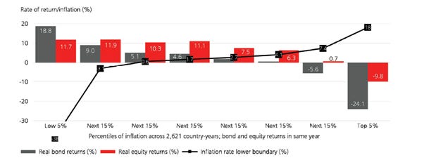
I shall return to diversification shortly, as it’s a key focus of this yearbook, but there is some useful data on inflation also. The authors remind us that while equites are an inflation hedge, stock markets do better in periods of low inflation, presumably because interest rates are lower.
Real Bond & Equity Returns vs Inflation 1900–2024
Source: UBS Global Investment Returns Yearbook
They point out that $1 in 1900 bought $37 of purchasing power today and that gold is a good hedge in inflationary periods:
Correlations between Inflation and Real Asset Returns 1900–2024
Source: UBS Global Investment Returns Yearbook
Before the “buy the dip” mentality became a standard refrain, investors used to be concerned about buying equities and then experiencing a dramatic fall in their value. This is probably a nagging concern today, especially for older investors considering, entering or in retirement.
Problems include the degree of drawdown and the time to recover the previous level. The chart shows the four biggest bear markets since 1900, and their drawdown and recovery times. After the 1929 Crash, US stocks fell to a trough in July 1932, and recovery eventually took until February 1945 - fifteen and a half years.
The next large drawdown was January 1973 to October 1974. In real terms, equities were underwater for over ten years. After the tech bubble burst in March 2000, US equity prices again slumped and it took seven and a half years for the market to recover, until July 2007, only to experience the Global Financial Crisis when the market bottomed in February 2009. It took four years to recover:
US Stockmarket Crashes and Recoveries
Source: UBS Global Investment Returns Yearbook
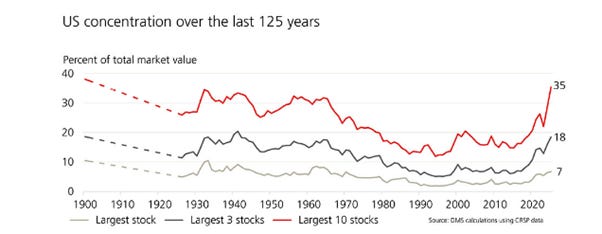
But it’s concentration and diversification which is the most interesting theme of this yearbook. When I wrote about this last year, I pointed out that levels of concentration then (and currently) were not unprecedented and that the railways created a much greater concentration in the late 19th and early 20th centuries. Here is the picture from 1900, with the data available in 1900, but it then restarts in 1926, hence the dotted lines:
US Stockmarket Concentration over Time
Source: UBS Global Investment Returns Yearbook via Citywire
Last year, I explain that the go-go tech stocks of the 1850s were the railroads and they comprised 63% of the total market capitalisation by 1900. I happened upon a chart in Adam Tooze’s Substack which analyses the US market constituents in 1812, as discovered by Jason Zweig in the Wall Street Journal:
1812 Market Concentration
Sources: Sylla and Wright/Jason Zweig/WSJ, Adam Tooze
I don’t have any historical data on the concentration of returns, which is what causes the real problem, but I doubt that returns have been this concentrated since the 19th century:
US Top 10 Stocks: Weighting and Return Last 5 years
Source: UBS Global Investment Returns Yearbook via Citywire
Conclusion
The report concludes that “The long run can take a very long time”.
The 21st century is now 25 years old and stock returns have been lower than over the 20th century, although global equity investors still enjoyed a real return of 3.5% p.a.
I like looking at longer cycles to understand trends in risk and return from stocks and bonds, because markets have been volatile and variable over very long periods. Extraplotaing from the last 10, 20 or even 40 years could be damaging to your wealth.
Premium subscribers can read on for the most surprising chart in the report, which was total news to me on a much discussed and apparently uncontroversial subject:


